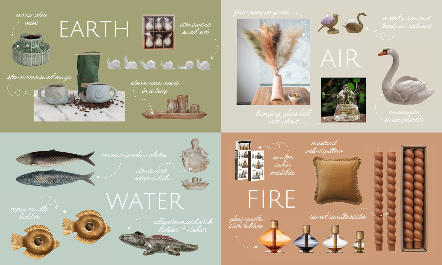
While there are plenty of choices we make in designing a space that influence its overall feeling, few are as impactful as our paint selections. Wall colours can make us feel warm and cozy, daring and bold, creative and passionate, or contemplative and serene. The more we are aware of our implicit emotional responses to the colour wheel, the more precise we can be about creating a space that communicates our desired aesthetic.
Pink is a shade with many connotations, providing its own distinct mood and atmosphere wherever it finds itself. We associate softer pinks with sweetness, romance, charm, femininity, and tenderness. In general, it’s an overwhelmingly positive colour, evoking feelings of affection, love, and serenity. Some colour theorists refer to the shade as red’s younger sister: while red stirs up feelings of aggression and passion, pink frolics happily in emotions of harmony and excitement. Both red and pink represent love, but red, being the bolder and more saturated hue, represents heat and depth in the romantic arena, whereas pink seems to call toward the subtler emotions involved in love, like friendship and flirtation: it’s no coincidence that when we’re feeling flattered, our cheeks blush a rosy tinge.

Moving along the scale from the soft, millennial pink we saw explode into popularity in the early twenty-first century (which still holds significant clout in the interior design world), to the hotter pinks, the associations with femininity become more aggressive and overt. Hot pink has long been emblematic of femininity in popular culture, slathered upon chick-flick movie posters and tasked with indicating products intended for a female buyer via packaging. In our current cultural moment, hotter pinks have become somewhat of a cliché, and when we do see them in schemes, they typically crop up as accent colors rather than as dominant tones. As feminism rose into the mainstream in the 20th century, the colour became the unofficial shade of the movement, harnessing the potent power of the stereotypical female, who’s favorite colour is most definitely pink, as reflected in her head-to-toe attire, that corporations had cultivated as a marketing tactic, to instead empower women in a radical reclamation of the shade. Perhaps because of its pervasiveness on the political stage as well as within the consumer world, hot pinks are rarely utilized in interior colour schemes. Thankfully, as strict gender roles dissipate on a global scale, pink is slowly but surely being seen in novel contexts.


The most popular shade of pink being used in interiors is of the subtler variety, providing just a hint of feminine energy and romantic allure. It works beautifully as a neutral, pairing with brown, navy, and charcoal hues to create just the right contrast with a tinge of personality. Delicate in its composition, pink eases us into contentment and charms us with its gentility, making it the ideal shade for bedrooms, bathrooms, or as an accent in a main living area. So go ahead, think pink!

Leave a comment (all fields required)
Comments will be approved before showing up.